Published-release documentation · release compatibility
Bar Chart Recipe
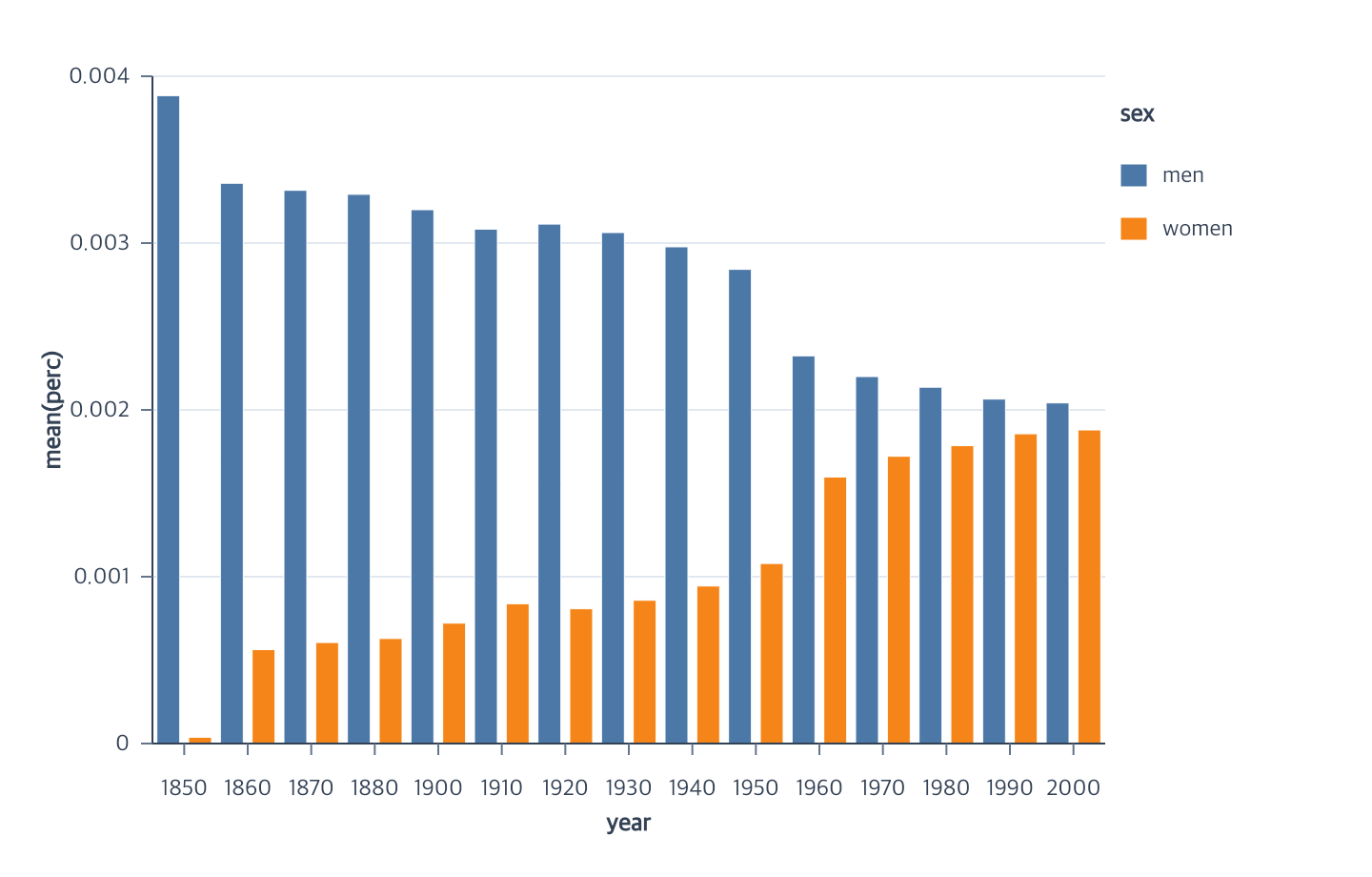
The current complete bar-chart example uses grouped bars. Grouping is a layout choice inside the bar chart, not a separate top-level chart type.
Minimal grouped flow
Runnable: install ggaction and provide the named data array as plain row objects.
import { chart } from "ggaction";

const program = chart()
  .createCanvas({ margin: { right: 140 } })
  .createData({ values })
  .createBarPlot({
    x: { field: "category", fieldType: "ordinal" },
    y: { field: "value", aggregate: "mean" },
    color: { field: "group", layout: "group" },
    width: { band: 0.72 }
  });
You must decide
- Ordinal x field
- Quantitative y field
- Nominal grouping/color field
The library infers
- Position type for field-string shorthand: finite numeric values are quantitative and other supported scalar values are nominal
- First-appearance x and group order
- Mean y at the final x/group grain
- xOffset slots from grouped color layout
- A
0.72bar-band fraction - Ordinal/linear axes, horizontal grid, and right-side legend
Missing x/group combinations are omitted. Change layout to stack, fill,
overlay, or diverging to use the other supported series arrangements.
Use encodeBarWidth({ pixels: 14 }) for a resize-stable logical width, or
encodeXOffset({ field: "group", paddingInner: 0.2, paddingOuter: 0.1 })
after grouped color to change within-band spacing. Reassign the group field
with one encodeColor({ field: "nextGroup", layout: "group" }) call.
The current API does not synthesize zero bars. For horizontal bars, put the
quantitative measure on x and the ordinal category on y.
Continue
Bar chart tutorial · Basic Charts · Ordinal bar positions · Ordinal offsets
Documentation provenance
293 actions · sha256:e755591a2e5f5e2b494867583876e28020a478c5220b77bdc6ad469a6224891d