Published-release documentation · release compatibility
Polar Arc Tutorial
Arc marks turn Polar positions into closed sector paths. Map a quantitative theta field directly to proportional sectors, aggregate categorical theta by count or weighted sum, or combine categorical theta bands with a quantitative radius for rose charts and radial bars.
Complete pie and donut plots
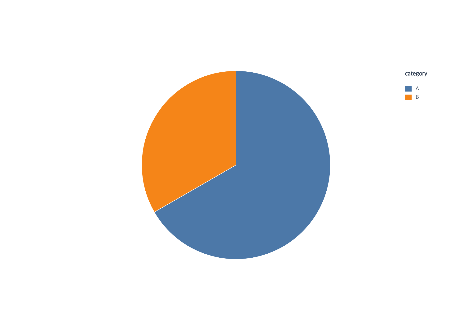
Use createPiePlot for a complete category count or explicitly weighted pie.
This is the count variant of the canonical examples/pie-plot/program.js:
import { chart, render } from "ggaction";

const program = chart()
  .createCanvas({ width: 1000, height: 700, margin: 150 })
  .createData({ id: "source", values: [
    { category: "A", value: 2 }, { category: "A", value: 3 },
    { category: "B", value: 5 }
  ] })
  .createPiePlot({ id: "pie", category: "category" });

render(program, document.querySelector("canvas").getContext("2d"));
A occupies 240° and B 120° because count uses source rows. To sum the value
field, replace the last chart action with
createPiePlot({ id: "pie", category: "category", value: "value", aggregate: "sum" });
the totals are then 5 and 5. Add arc: { innerRadius: 0.55, padAngle: 2 } to that
call for the canonical donut variant. The hole and padding do not change those totals.
The facade requires a category even for numeric category labels. It defaults
to a category color legend without axes or grid. For one fill color, set
color: false and arc: { fill: "#4c78a8" }. The full package provides this
action; it is not part of ggaction/basic. The lower actions below remain
available for direct row weights, rose charts and independent editing.
Map values directly into a pie
When each row already contains one category and its final numeric value, pass
that value field directly to encodeTheta:
const data = [
  { source: "Search", visitors: 50 },
  { source: "Direct", visitors: 20 },
  { source: "Social", visitors: 20 },
  { source: "Referral", visitors: 10 }
];

const pie = chart()
  .createCanvas()
  .createData({ values: data })
  .createArcMark()
  .encodeTheta({ field: "visitors" })
  .encodeColor({ field: "source" });
Each positive row becomes one sector, in source-row order, and its sweep is its
value divided by the sum of all positive values. Zero values are omitted.
Values must be non-negative finite numbers and the total must be positive.
encodeR is not combined with direct quantitative arc theta.
Count a category into a donut
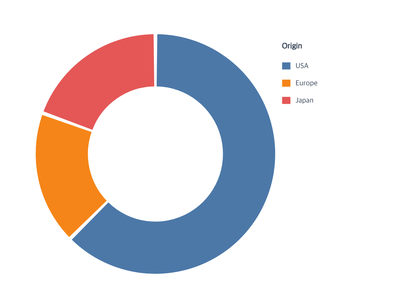
The shortest donut flow needs a dataset, an arc mark with a nonzero inner radius, a count-based theta encoding, and color:
Start with the Vite project from Getting Started, then place the tutorial dataset in Vite’s public directory:
mkdir -p public
curl --fail --location https://raw.githubusercontent.com/ggaction/ggaction/6422776b0a379c8c89809f41b434f366fbc1f143/data/cars.json --output public/cars.json
Complete program
import { chart, render } from "ggaction";

const response = await fetch("/cars.json");
if (!response.ok) throw new Error(`Failed to load cars: ${response.status}`);
const cars = await response.json();

const program = chart()
  .createCanvas({
    width: 640,
    height: 500,
    margin: { top: 55, right: 190, bottom: 55, left: 55 }
  })
  .createData({ values: cars })
  .createArcMark({ innerRadius: 0.56, padAngle: 1.5 })
  .encodeTheta({ field: "Origin", aggregate: "count" })
  .encodeColor({ field: "Origin", palette: "tableau10" })
  .createGuides({
    axes: false,
    grid: false,
    legend: { position: "right", title: "Origin" }
  });

render(program, document.querySelector("canvas").getContext("2d"));
aggregate: "count" assigns one sector to each category and makes its angular
sweep proportional to the category count. The omitted radius encoding uses the
available Polar radius. innerRadius is a fraction of that available radius.
Sum a field into weighted sectors
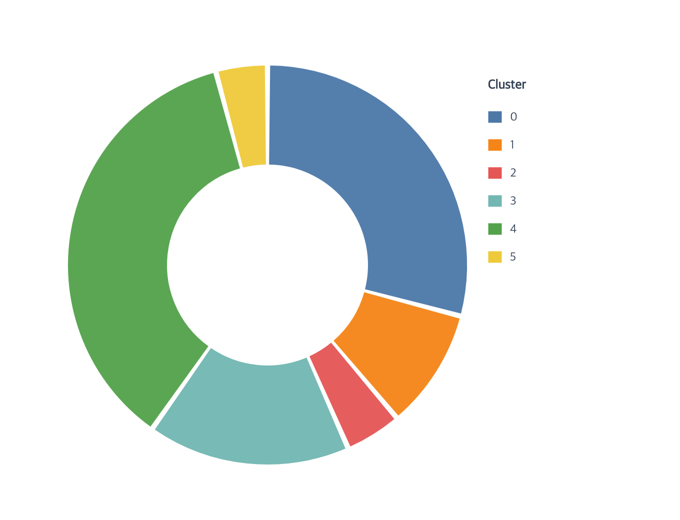
Use aggregate: "sum" when each source row contributes a numeric weight rather
than one count. This example filters Gapminder to one year and partitions the
donut by the total population in each cluster:
const clusterOrder = [0, 1, 2, 3, 4, 5];
const populationByCluster = chart()
  .createCanvas({
    width: 680,
    height: 520,
    margin: { top: 65, right: 200, bottom: 55, left: 55 }
  })
  .createData({ values: gapminder.filter(row => row.year === 2005) })
  .createArcMark({ innerRadius: 0.5, padAngle: 1.25 })
  .encodeTheta({
    field: "cluster",
    fieldType: "nominal",
    aggregate: "sum",
    weight: "pop",
    scale: { domain: clusterOrder }
  })
  .encodeColor({
    field: "cluster",
    fieldType: "nominal",
    scale: { domain: clusterOrder }
  })
  .createGuides({ axes: false, grid: false, legend: { title: "Cluster" } });
Repeated categories and fractional weights are valid. Every weight must be a non-negative finite number, and the total must be positive. Invalid input fails before semantic state or trace changes; source rows are never expanded.
Measured rose and radial bar plots
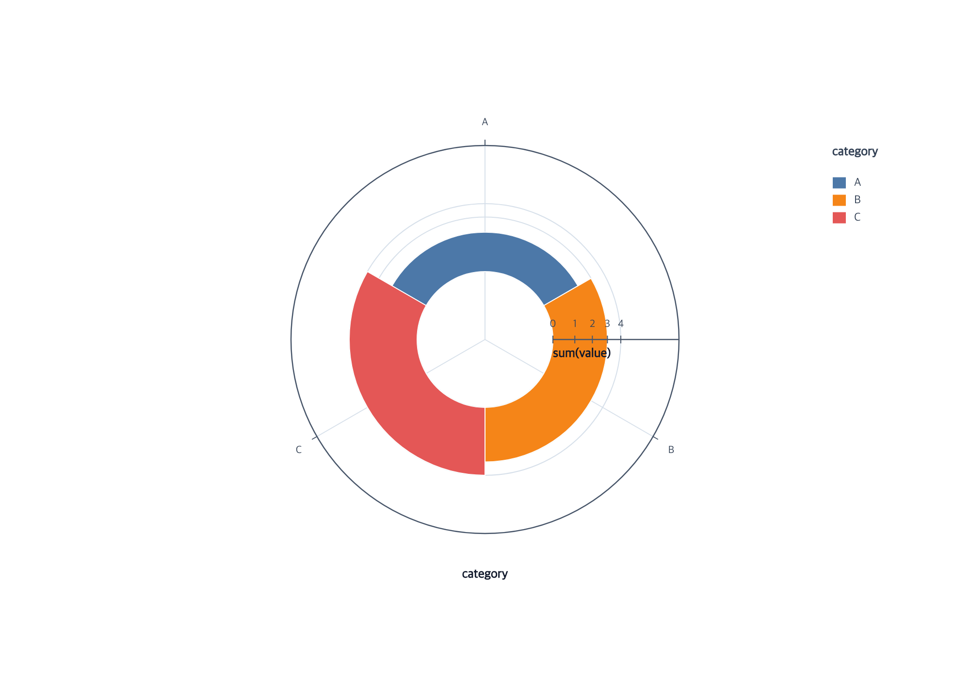
createRosePlot makes annular area proportional to category count or sum.
createRadialBarPlot makes length from the inner edge proportional to the same
measure. This is the canonical examples/radial-sectors/program.js rose-hole variant:
import { chart, render } from "ggaction";
const program = chart()
  .createCanvas({ width: 1000, height: 700, margin: 150 })
  .createData({ id: "source", values: [
    { category: "A", value: 2 }, { category: "B", value: 3 }, { category: "C", value: 4 }
  ] })
  .createRosePlot({ id: "sectors", category: "category", value: "value", aggregate: "sum", radiusScale: { range: [70, 140] } });
render(program, document.querySelector("canvas").getContext("2d"));
The inner radius is 70 pixels. Outer radii are approximately 110.68, 126.19,
and 140, preserving annular area ratios 2:3:4. Replacing the chart action with
createRadialBarPlot gives radii 105, 122.5, and 140, preserving radial length
ratios 2:3:4. Without value/aggregate, both actions count rows per category.
The full package provides both actions. Zero categories stay in the domain and
legend but draw no sector. Use color:false for one arc.fill, or guides:false
to skip guides. These measured modes require padAngle:0, a zero-based linear
scale, and non-negative finite values with at least one positive category.
Edit the result through encodeR, editArcMark, editScale, category ordering,
and guide actions. See the position encoding reference for the equivalent lower chain.
Rose overlays
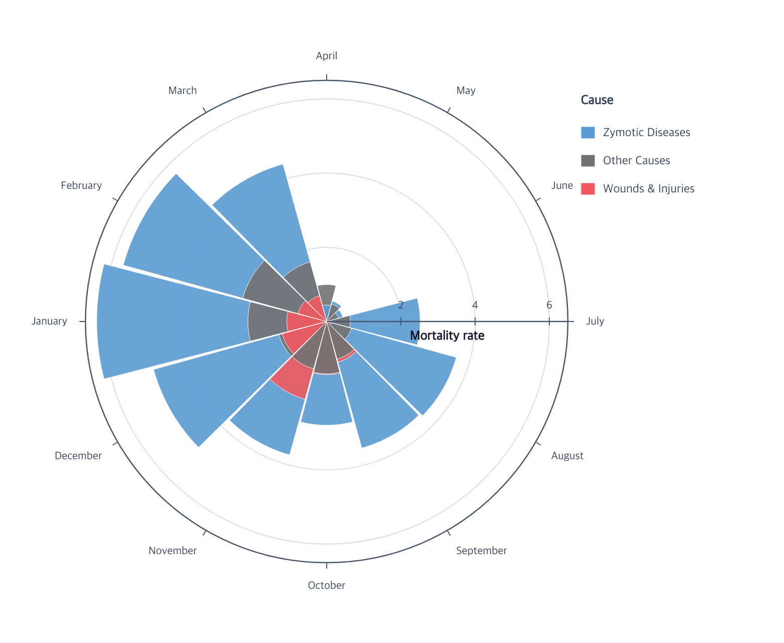
This lower-level overlay uses equal theta bands and maps each source row to radial length.
For category sums represented by annular area, use createRosePlot above. The three causes
share each month band. The following fragment continues from an imported chart
function and a loaded nightingaleRows array containing one row per month and
cause.
const monthOrder = [
  "April", "May", "June", "July", "August", "September",
  "October", "November", "December", "January", "February", "March"
];
const causeOrder = [
  "Zymotic Diseases", "Other Causes", "Wounds & Injuries"
];

const rose = chart()
  .createCanvas({
    width: 780,
    height: 640,
    margin: { top: 80, right: 210, bottom: 80, left: 80 }
  })
  .createData({ values: nightingaleRows })
  .createArcMark({ padAngle: 1, opacity: 0.9, strokeWidth: 0.5 })
  .encodeTheta({
    field: "month",
    fieldType: "ordinal",
    scale: { domain: monthOrder }
  })
  .encodeR({ field: "value", scale: { domain: [0, 6.5], zero: true } })
  .encodeColor({
    field: "cause",
    layout: "overlay",
    scale: {
      domain: causeOrder,
      range: ["#599ad3", "#727272", "#f1595f"]
    }
  })
  .createGuides({
    axes: {
      theta: { title: false },
      radius: {
        ticksAndLabels: { values: [2, 4, 6] },
        title: { text: "Mortality rate", position: "inside" }
      }
    },
    grid: { theta: false, radial: { values: [2, 4, 6] } },
    legend: { position: "right", title: "Cause" }
  });
layout: "overlay" is explicit because multiple rows occupy the same theta
band. Larger sectors render first so smaller values remain visible. Values that
do not extend beyond the radial baseline produce no placeholder path.
Radial bars
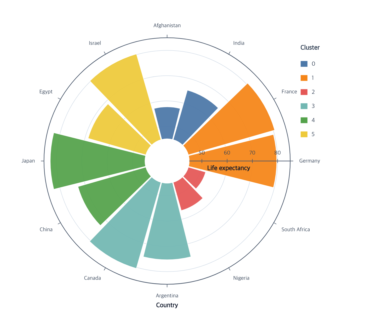
Radial bars use the same position pair without an overlay group. This fragment
assumes chart, the selected countryRows, and their explicit countryOrder
are already available:
const radialBars = chart()
  .createCanvas({
    width: 780,
    height: 640,
    margin: { top: 75, right: 190, bottom: 75, left: 75 }
  })
  .createData({ values: countryRows })
  .createArcMark({ innerRadius: 0.18, padAngle: 2, opacity: 0.94 })
  .encodeTheta({
    field: "country",
    fieldType: "nominal",
    scale: { domain: countryOrder }
  })
  .encodeR({
    field: "life_expect",
    scale: { domain: [45, 85], zero: false }
  })
  .encodeColor({ field: "cluster", fieldType: "nominal", palette: "tableau10" })
  .createGuides({
    axes: {
      theta: { title: { text: "Country" } },
      radius: {
        ticksAndLabels: { values: [50, 60, 70, 80] },
        title: { text: "Life expectancy", position: "inside" }
      }
    },
    grid: { theta: false, radial: { values: [50, 60, 70, 80] } },
    legend: { position: "right", title: "Cluster" }
  });
The resolved radius scale begins at the arc’s inner radius. The radial axis uses that same baseline instead of drawing through the empty center.
Editing an arc
editArcMark updates geometry or appearance and rematerializes every sector:
const tighter = radialBars.editArcMark({
  innerRadius: 0.24,
  padAngle: 1,
  opacity: 0.8
});
Related
Arc mark reference · Position encodings · Polar guides
Documentation provenance
293 actions · sha256:e755591a2e5f5e2b494867583876e28020a478c5220b77bdc6ad469a6224891d