Published-release documentation · release compatibility
Rose Chart Recipe
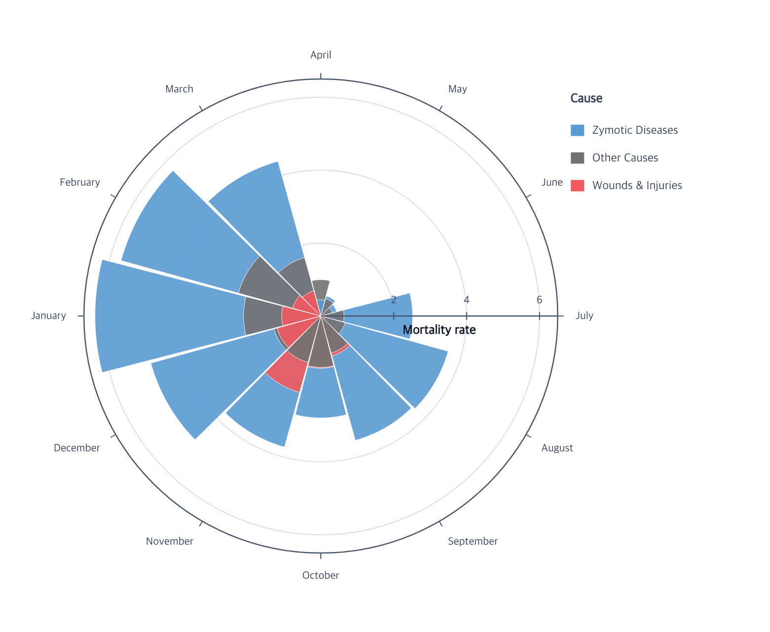
A rose chart compares several magnitudes inside equal categorical angle bands. The overlay layout draws larger sectors first so smaller sectors remain visible.
Minimal flow
Runnable: install ggaction and provide the named data array as plain row objects.
import { chart } from "ggaction";

const monthOrder = [
  "April", "May", "June", "July", "August", "September",
  "October", "November", "December", "January", "February", "March"
];
const causeOrder = ["Zymotic Diseases", "Other Causes", "Wounds & Injuries"];

const program = chart()
  .createCanvas({
    width: 780,
    height: 640,
    margin: { top: 80, right: 210, bottom: 80, left: 80 }
  })
  .createData({ values: nightingaleRows })
  .createArcMark({ padAngle: 1, opacity: 0.9, strokeWidth: 0.5 })
  .encodeTheta({
    field: "month",
    fieldType: "ordinal",
    scale: { domain: monthOrder }
  })
  .encodeR({ field: "value", scale: { domain: [0, 6.5], zero: true } })
  .encodeColor({
    field: "cause",
    layout: "overlay",
    scale: {
      domain: causeOrder,
      range: ["#599ad3", "#727272", "#f1595f"]
    }
  })
  .createGuides({
    axes: {
      theta: { title: false },
      radius: {
        ticksAndLabels: { values: [2, 4, 6] },
        title: { text: "Mortality rate", position: "inside" }
      }
    },
    grid: { theta: false, radial: { values: [2, 4, 6] } },
    legend: { position: "right", title: "Cause" }
  });
nightingaleRows is an array with month, cause, and finite numeric value
properties. Each month/cause pair should appear at most once.
You must decide
- The ordered categorical theta field and its complete domain
- The quantitative radial field
- The category that identifies overlaid sectors
- An explicit overlay layout when multiple rows occupy one theta band
The library infers
- One Polar coordinate shared by all sectors
- Equal theta bands for the ordered categories
- Concrete radial sector paths sorted larger-first inside each band
- Applicable Polar axes, radial grid, and categorical legend
Continue
Polar arc tutorial · Arc marks · Polar positions · Guides
Documentation provenance
293 actions · sha256:e755591a2e5f5e2b494867583876e28020a478c5220b77bdc6ad469a6224891d