Published-release documentation · release compatibility
Bar Chart Tutorial
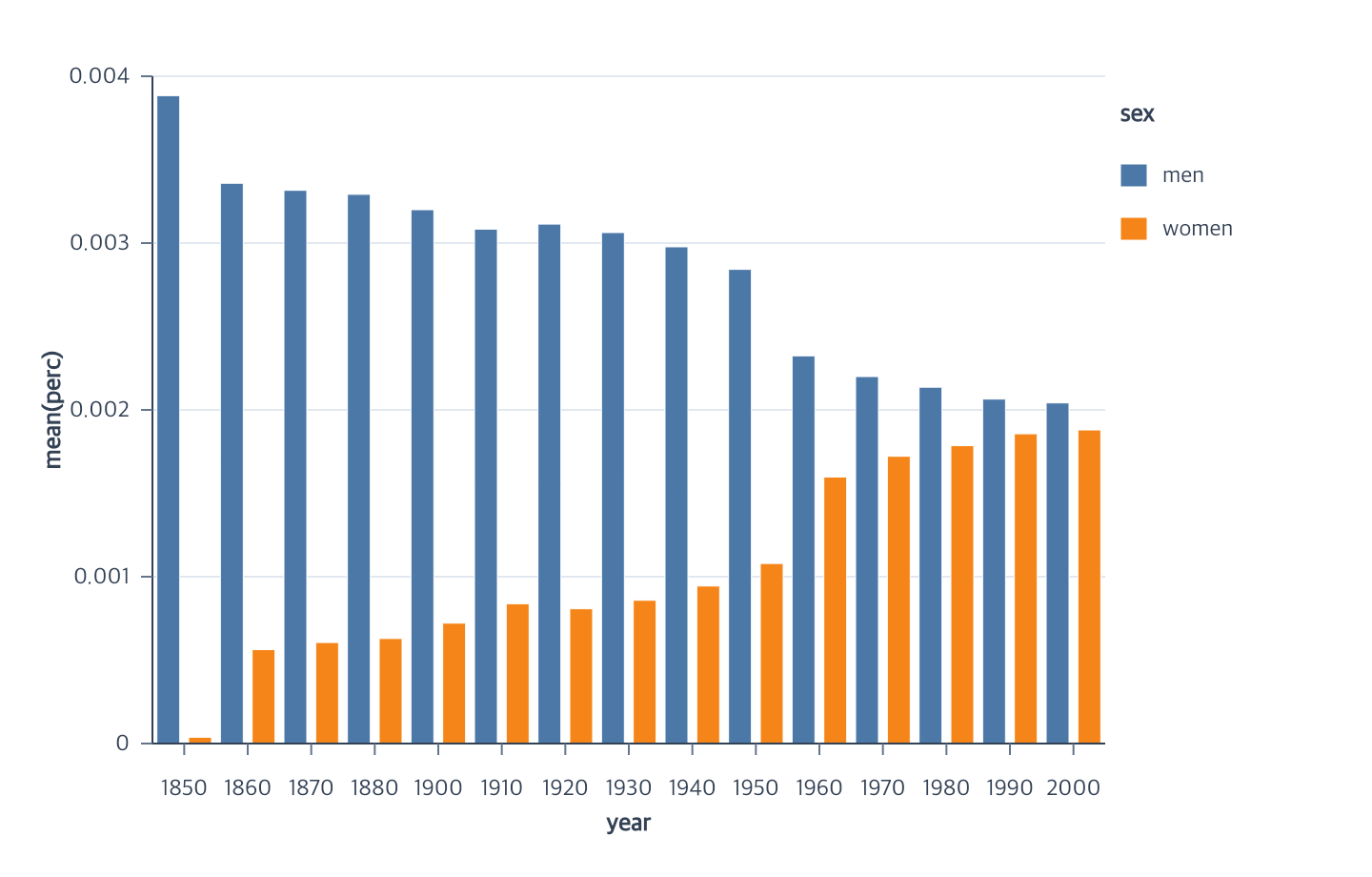
This tutorial uses a grouped bar chart as one concrete bar-chart layout. It aggregates job percentages by year and places the mean for men and women side by side. The complete module uses the public npm package. The repository also contains a runnable browser example and its complete program.
Start with the Vite project from Getting Started, then place the tutorial dataset in Vite’s public directory:
mkdir -p public
curl --fail --location https://raw.githubusercontent.com/ggaction/ggaction/6422776b0a379c8c89809f41b434f366fbc1f143/data/jobs.json --output public/jobs.json
Complete program
import { chart, render } from "ggaction";

const response = await fetch("/jobs.json");
if (!response.ok) throw new Error(`Failed to load jobs: ${response.status}`);
const jobs = await response.json();

const rows = jobs.filter(
  row =>
    Number.isFinite(row.year) &&
    Number.isFinite(row.perc) &&
    typeof row.sex === "string" &&
    row.sex.length > 0
);

const program = chart()
  .createCanvas({
    width: 720,
    height: 460,
    margin: { top: 40, right: 140, bottom: 70, left: 80 }
  })
  .createData({ id: "jobs", values: rows })
  .createBarPlot({
    id: "bars",
    x: { field: "year", fieldType: "ordinal" },
    y: {
      field: "perc",
      aggregate: "mean",
      scale: { nice: true, zero: false }
    },
    color: {
      field: "sex",
      layout: "group",
      scale: { palette: "tableau10" }
    },
    width: { band: 0.72 }
  });

render(program, document.querySelector("#chart").getContext("2d"));
What the actions establish
| Stage | Semantic result | Graphical result |
|---|---|---|
createBarPlot |
Bar layer, ordinal/aggregate positions, grouped color and guides | Concrete grouped rectangles plus ordinal/linear axes, grid, and legend |
layout: "group" is the atomic grouping choice. It keeps y unstacked and
invokes the advanced xOffset encoding for the same field. encodeBarWidth
then has enough stored information to materialize one concrete rectangle for
each observed year/sex cell. Missing cells are omitted.
Width, spacing, and reassignment
Use exactly one width mode. Band width follows a resized Canvas; logical pixels stay fixed and are independent of PNG output density.
program.encodeBarWidth({ pixels: 14 });
Advanced offset padding changes slot bandwidth while retaining each year band:
program.encodeXOffset({
  field: "sex",
  paddingInner: 0.2,
  paddingOuter: 0.1
});
To replace the grouped field, call color once. It replaces color and xOffset together and refreshes an existing legend:
program.encodeColor({ field: "job", layout: "group" });
Key action trace
Grouped color owns the matching offset encoding. Completed positions and
group offsets can materialize rectangles with the default width. This example
uses encodeBarWidth to record its explicit band width before guide creation.
program
└─ createBarPlot
   ├─ createBarMark
   ├─ encodeX
   ├─ encodeY
   ├─ encodeColor
   │  ├─ encodeXOffset
   │  └─ rematerializeBarMark
   ├─ encodeBarWidth
   │  └─ rematerializeBarMark
   └─ createGuides
      ├─ createAxes
      ├─ createGrid
      └─ createLegend
Run and continue
- Serve the repository root and open
examples/jobs-grouped-bar/. - View the complete chart program.
- Continue with Position encodings, Series encodings, and Constant appearance, or review the Basic Chart contract.
Documentation provenance
293 actions · sha256:e755591a2e5f5e2b494867583876e28020a478c5220b77bdc6ad469a6224891d