Published-release documentation · release compatibility
Cars Line Chart Tutorial
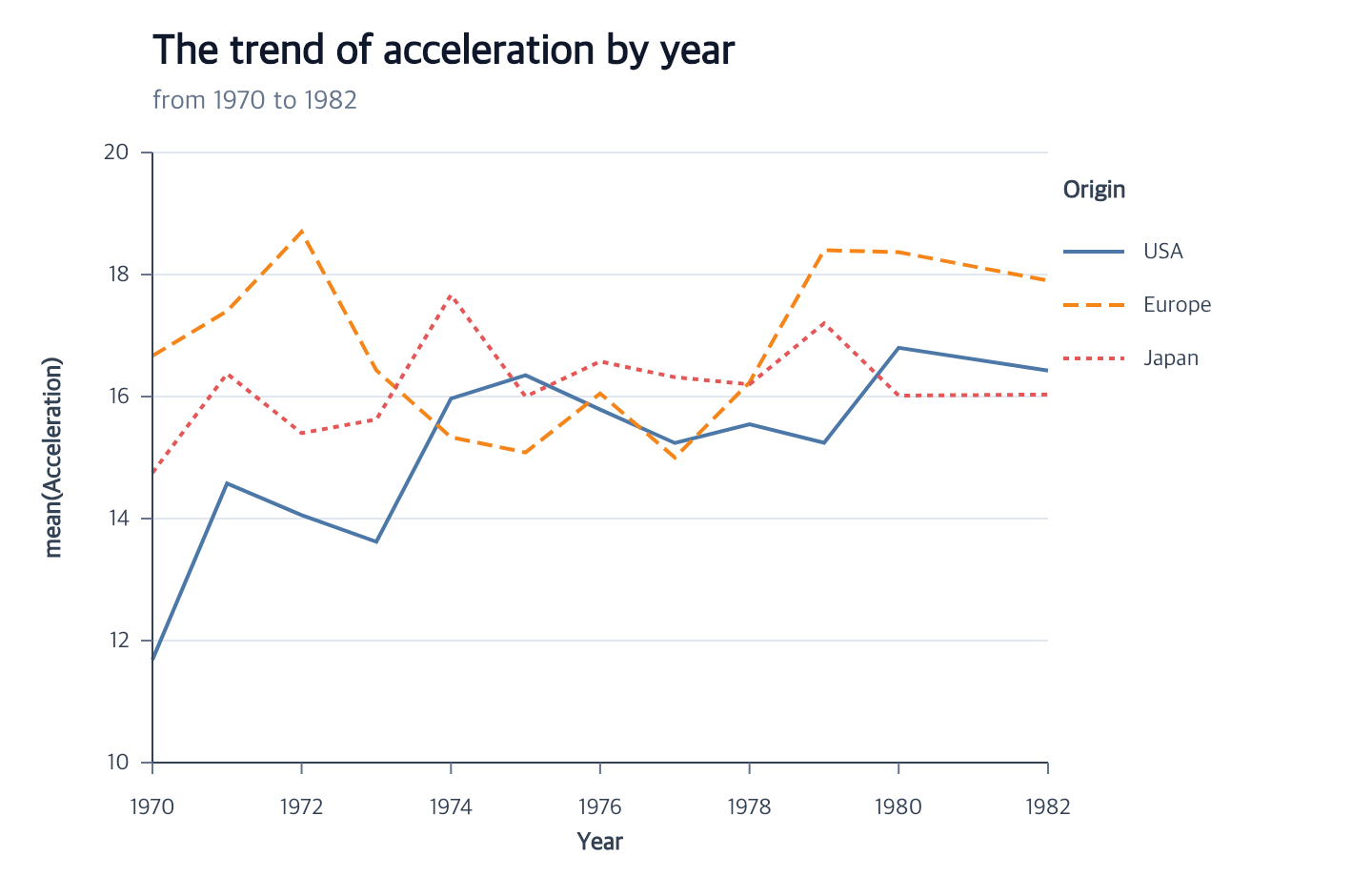
This chart shows mean acceleration over time for each origin. The complete module below uses the public npm package. The repository also contains a runnable browser example and its complete program.
Start with the Vite project from Getting Started, then place the tutorial dataset in Vite’s public directory:
mkdir -p public
curl --fail --location https://raw.githubusercontent.com/ggaction/ggaction/6422776b0a379c8c89809f41b434f366fbc1f143/data/cars.json --output public/cars.json
Complete program
import { chart, render } from "ggaction";

const response = await fetch("/cars.json");
if (!response.ok) throw new Error(`Failed to load cars: ${response.status}`);
const cars = await response.json();

const rows = cars.filter(
  car =>
    typeof car.Year === "string" &&
    Number.isFinite(Date.parse(car.Year)) &&
    Number.isFinite(car.Acceleration) &&
    typeof car.Origin === "string" &&
    car.Origin.length > 0
);

const program = chart()
  .createCanvas({
    width: 720,
    height: 460,
    margin: { top: 80, right: 170, bottom: 60, left: 80 }
  })
  .createData({ id: "cars", values: rows })
  .createLinePlot({
    id: "trends",
    x: {
      field: "Year",
      fieldType: "temporal",
      scale: { nice: true }
    },
    y: {
      field: "Acceleration",
      aggregate: "mean",
      scale: { nice: true, zero: false }
    },
    color: { field: "Origin", scale: { palette: "tableau10" } },
    strokeDash: { field: "Origin" },
    guides: { axes: { y: { ticksAndLabels: { count: 6 } } } }
  })
  .createTitle({
    text: "The trend of acceleration by year",
    subtitle: "from 1970 to 1982"
  });

render(program, document.querySelector("#chart").getContext("2d"));
What the actions establish
| Stage | Semantic result | Graphical result |
|---|---|---|
createLinePlot |
Line layer, temporal/aggregate positions, series appearance, scales, and guides | Sorted concrete series paths plus axes, grid, and combined legend |
createTitle |
Chart title and subtitle text | Plot-aligned text graphics |
The source rows remain immutable. Aggregation creates derived series values;
it does not replace the dataset. Because color and stroke dash encode the same
field and ordered domain, createGuides combines them into one legend.
Change the curve
Curve is line appearance rather than a semantic field encoding. It can be set inside the facade:
.createLinePlot({
  id: "trends",
  x: { field: "Year", fieldType: "temporal" },
  y: { field: "Acceleration", aggregate: "mean" },
  line: { curve: "step" }
})
or edited after the complete chart exists:
const smooth = program.editLineMark({
  curve: "monotone",
  strokeWidth: 4
});
Both forms regenerate backend-neutral path commands. The stored x/y fields, mean aggregation, grouping, scales, axes, and legend remain unchanged.
Change the dash assignment
Use named styles in a field scale when each series needs its own pattern:
const named = program.encodeStrokeDash({
  field: "Origin",
  scale: { range: ["solid", "dashed", "dotted"] }
});
Or replace the field mapping with one constant pattern:
const dotted = named.encodeStrokeDash({ value: "dotted" });
The second call removes stroke dash from the categorical legend while keeping any remaining color component. It also preserves the old named scale as an immutable semantic resource.
Key action trace
Aggregate and series actions explicitly rematerialize the path; the renderer does not infer those relationships later.
program
├─ createLinePlot
│  ├─ createLineMark
│  ├─ encodeX
│  ├─ encodeY
│  │  └─ rematerializeLineMark
│  ├─ encodeColor
│  │  └─ rematerializeLineMark
│  ├─ encodeStrokeDash
│  │  └─ rematerializeLineMark
│  └─ createGuides
│     ├─ createAxes
│     ├─ createGrid
│     └─ createLegend
└─ createTitle
Run and continue
- Serve the repository root and open
examples/cars-line-chart/. - View the complete chart program.
- Continue with Encodings, Guides, Titles, and the Basic Chart contract.
Documentation provenance
293 actions · sha256:e755591a2e5f5e2b494867583876e28020a478c5220b77bdc6ad469a6224891d